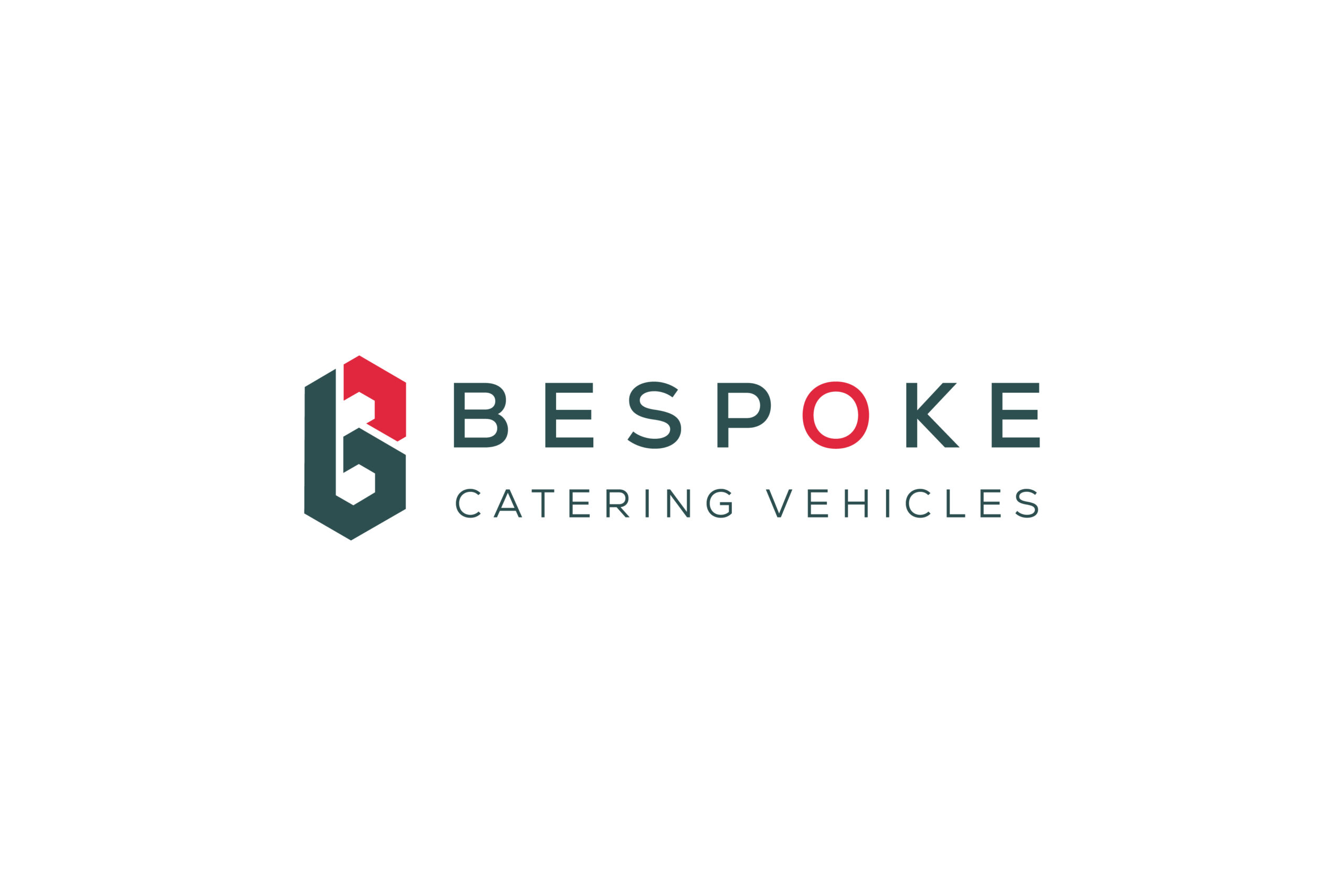
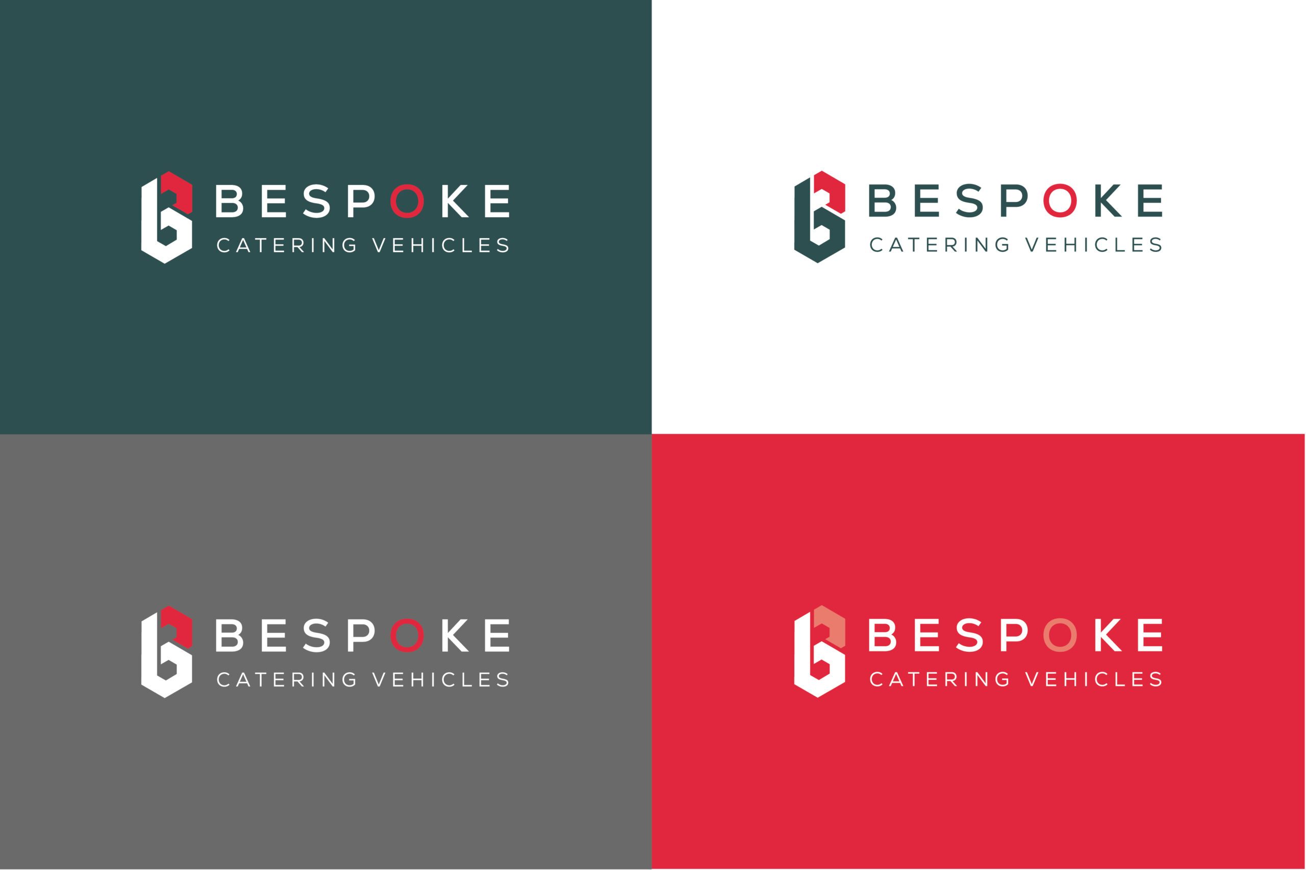
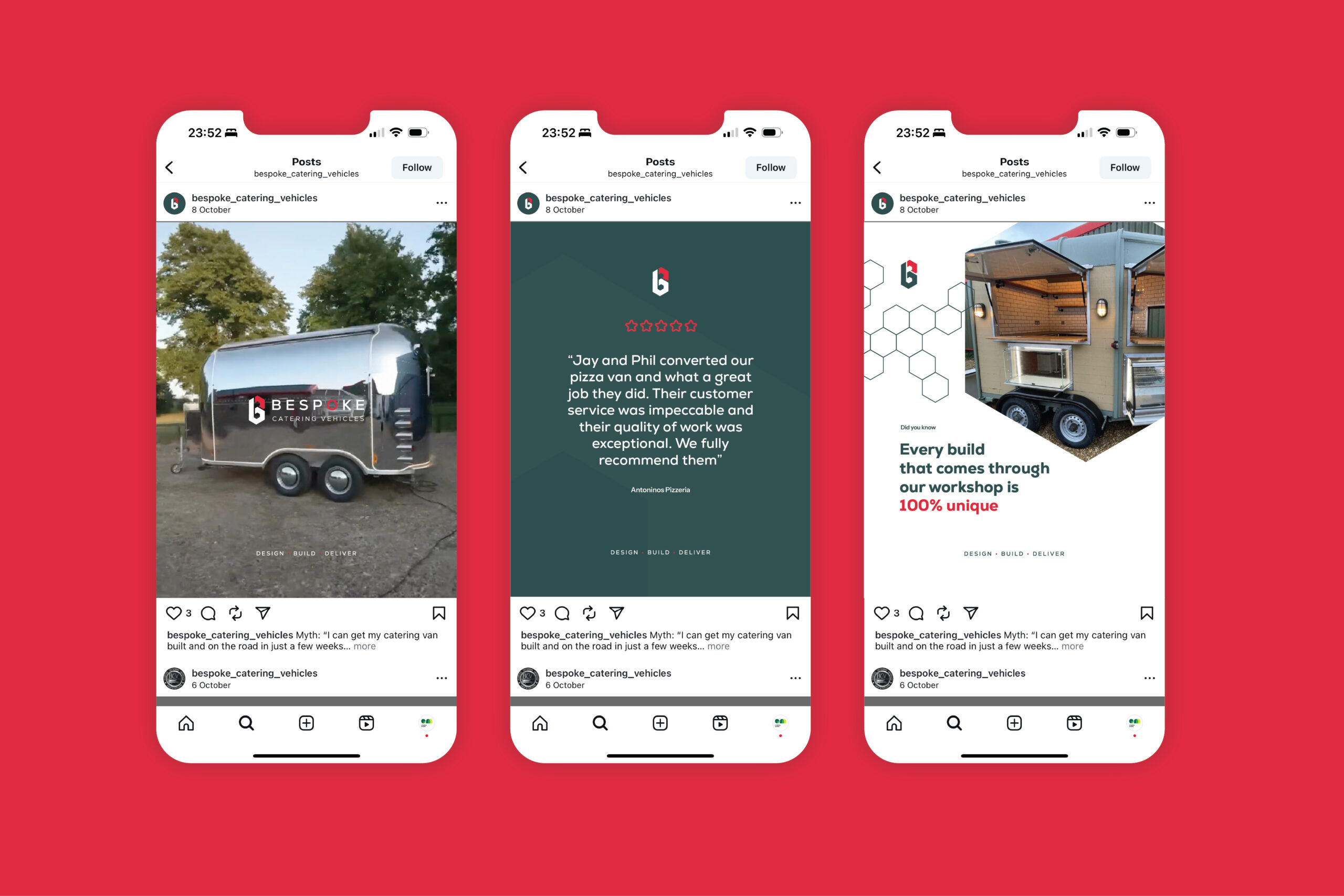

This was a truly collaborative project with Steve, Jay and Phil — a great team who knew exactly what they wanted: a high-end identity that reflected the quality of their craftsmanship, without leaning on the usual trailer or van clichés.
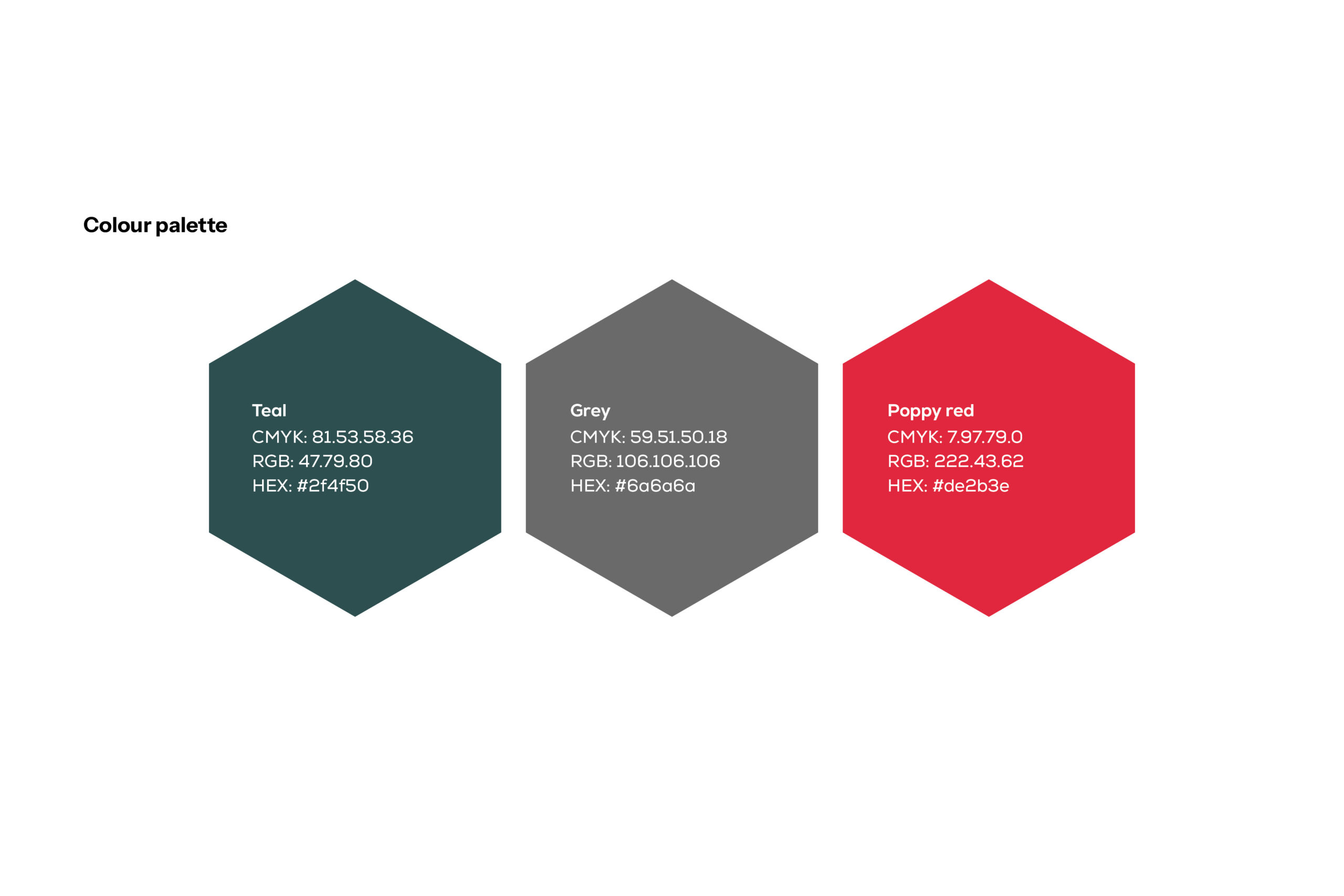
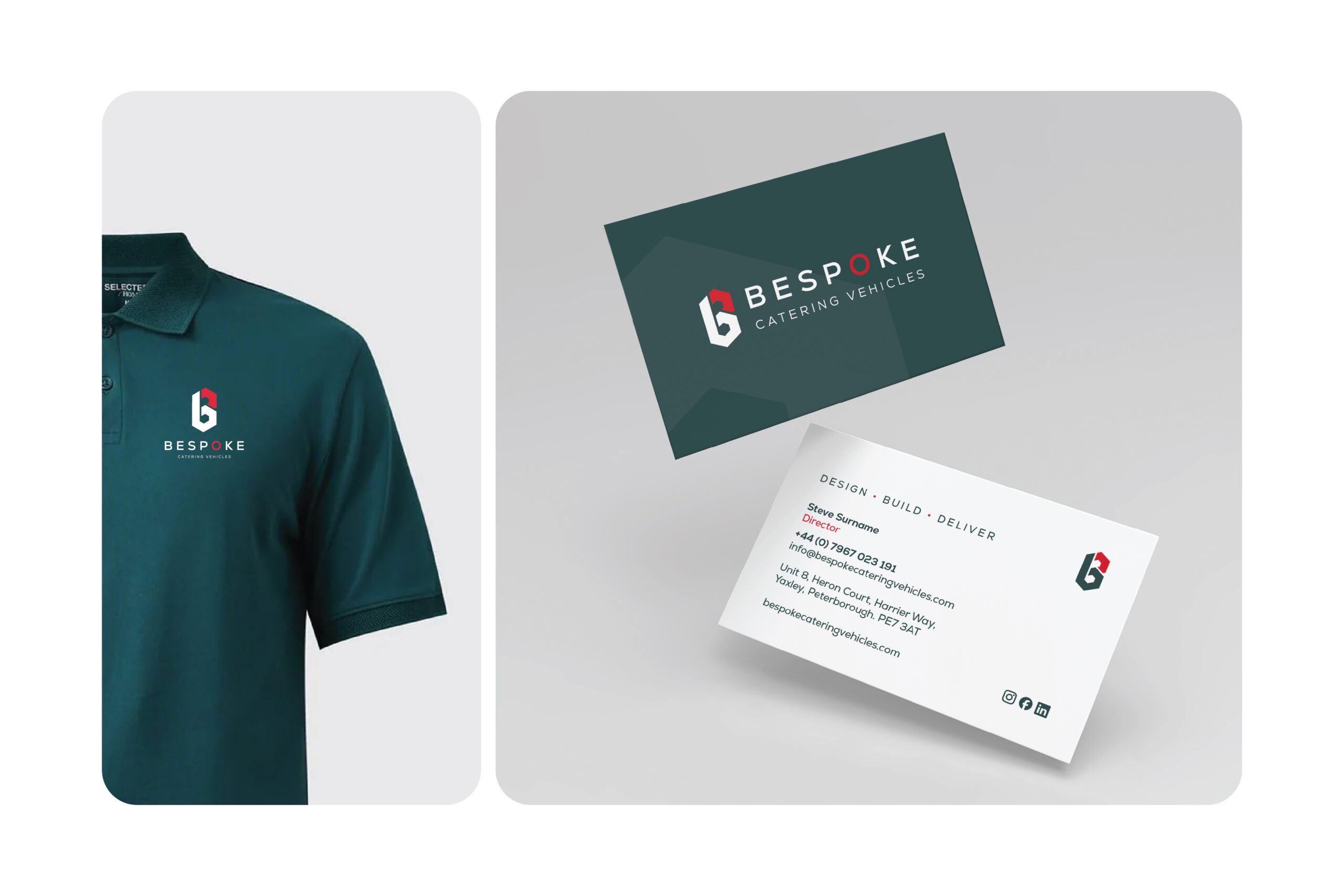
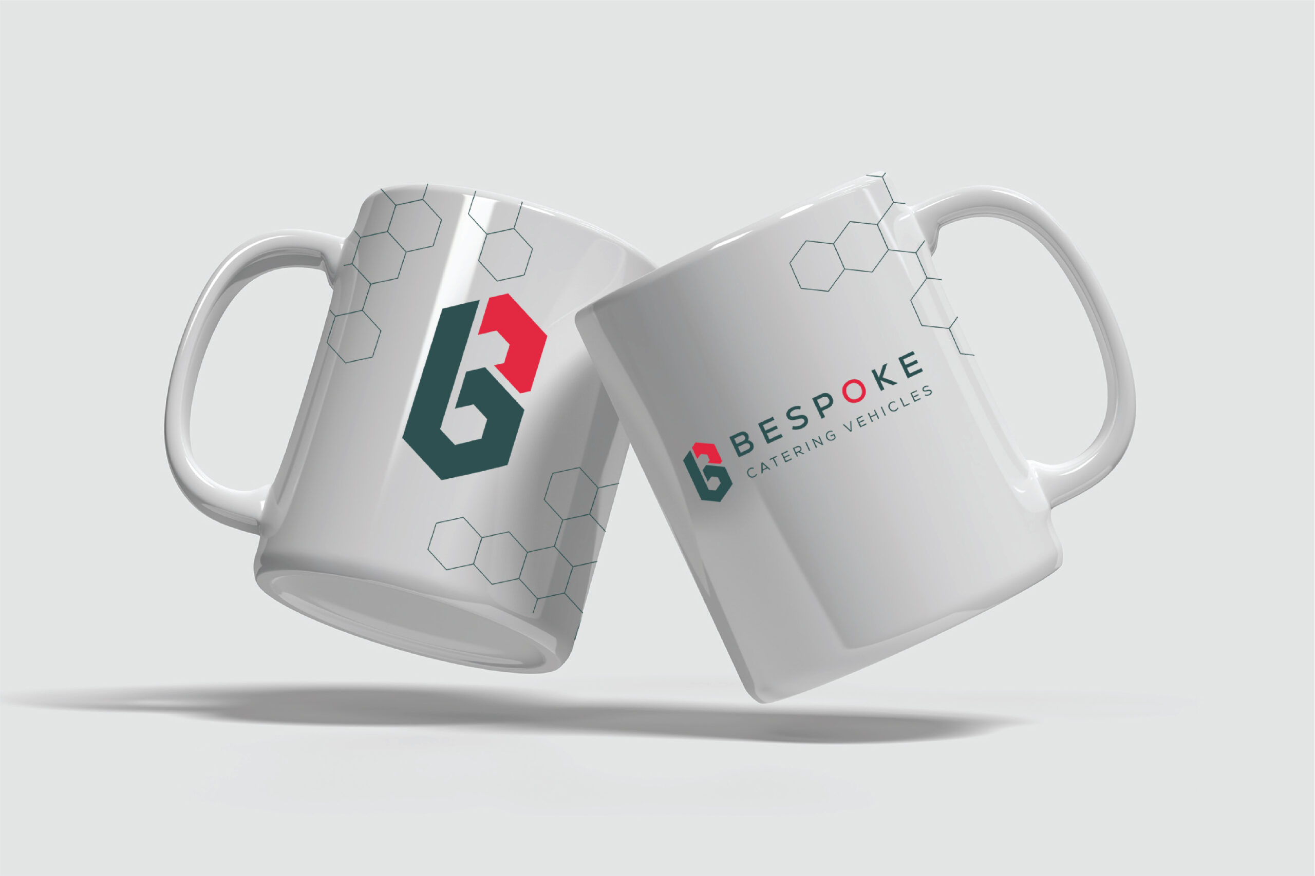
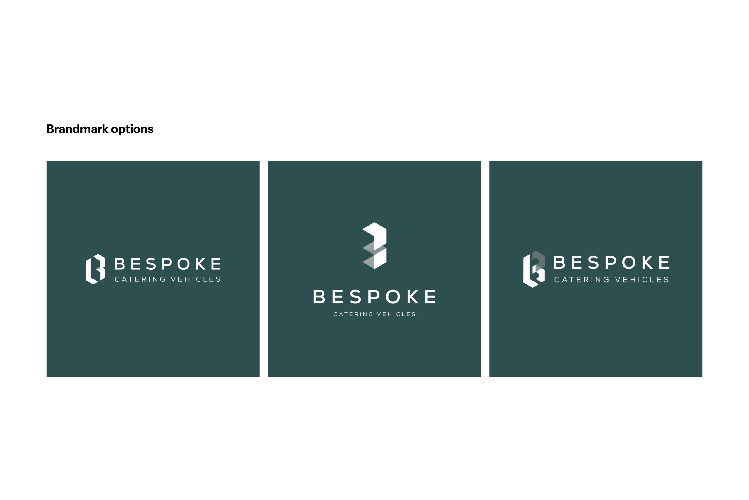
We built the rebrand around their existing grey and teal palette, adding a subtle accent tone to elevate and modernise the look. The new abstract ‘B’ brand mark draws from ideas of fabrication and structure, echoing how every vehicle is carefully crafted and built to last.
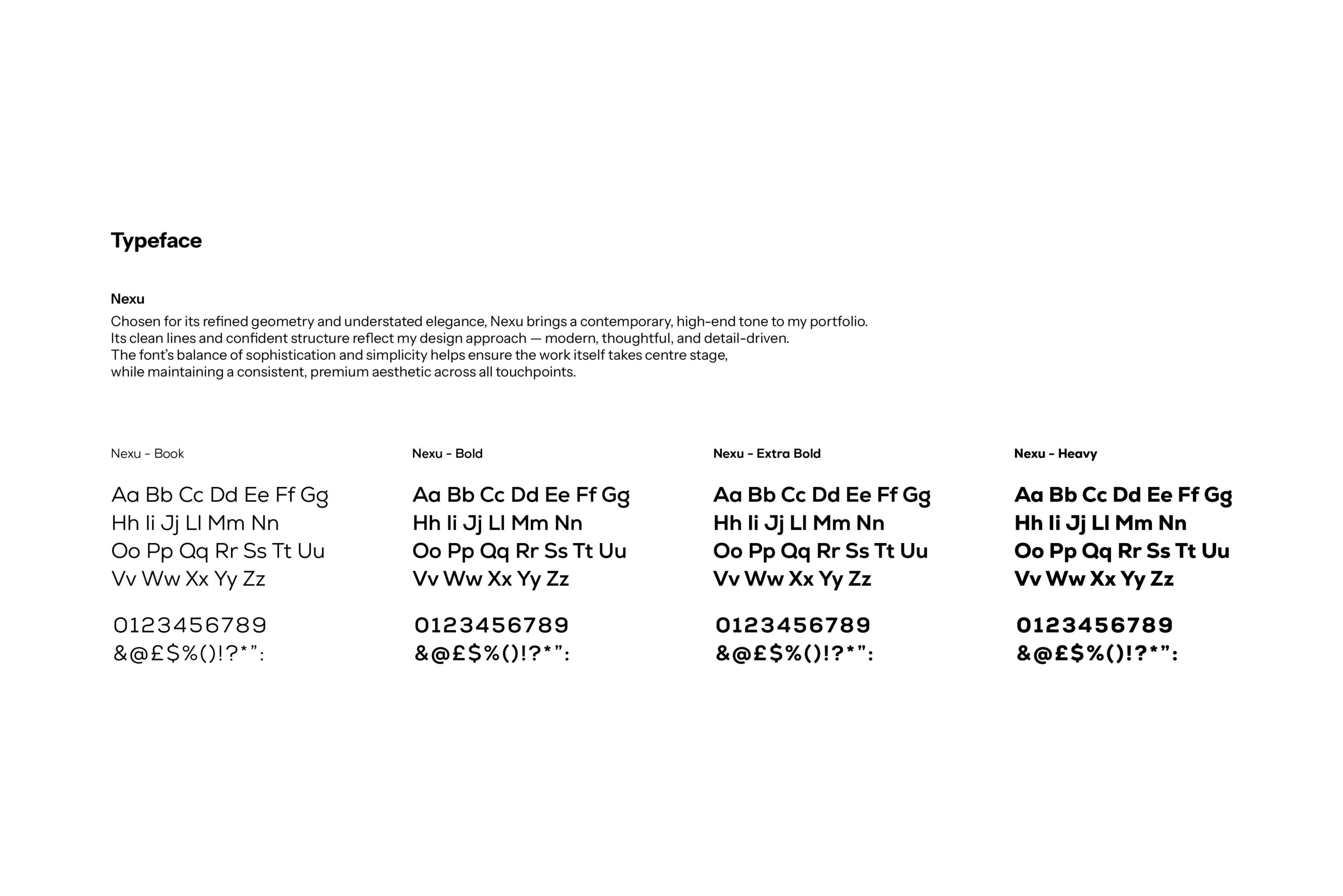
Using the Nexu typeface tied everything together — clean, confident and contemporary — giving the brand a more premium, professional edge that still feels authentic to their roots.